Sandy Hands British Sign Language.
Brand Identity. Illustration.
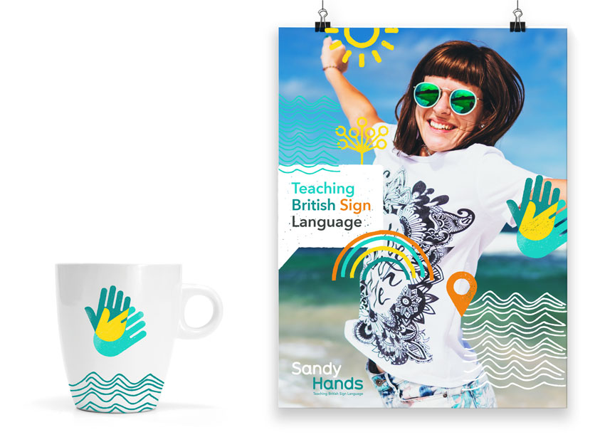
Logo and brand design for Sandy Hands British Sign Language. Bold, vibrant, fun and friendly!
Starting with the ‘common’ sign for ‘sign language’ we developed a simplified/friendly hand that creates a vibrant image. The overlay creates a third part highlight that suggests the energy of people coming together e.g Sandy Hands + participants. The hands’ icon combined with a friendly rounded typeface creates a ‘happy’ logo and openness. Bright, vibrant coastal colours. Bold use of icons and illustrations. Friendly, fun and full of flavour. Texture, emotion, expressive.
In British Sign Language teaching, Sandy Hands refers to a technique that involves using the hands to create a tactile experience for deaf learners, helping them to feel the movements and shapes involved in producing signs. This technique is particularly useful for young learners or those who are new to sign language, as it can enhance their understanding and retention of new signs.


