TPAT - Truro and Penwith Academy Trust.
Animation. Brand Identity. Illustration. Print Design.
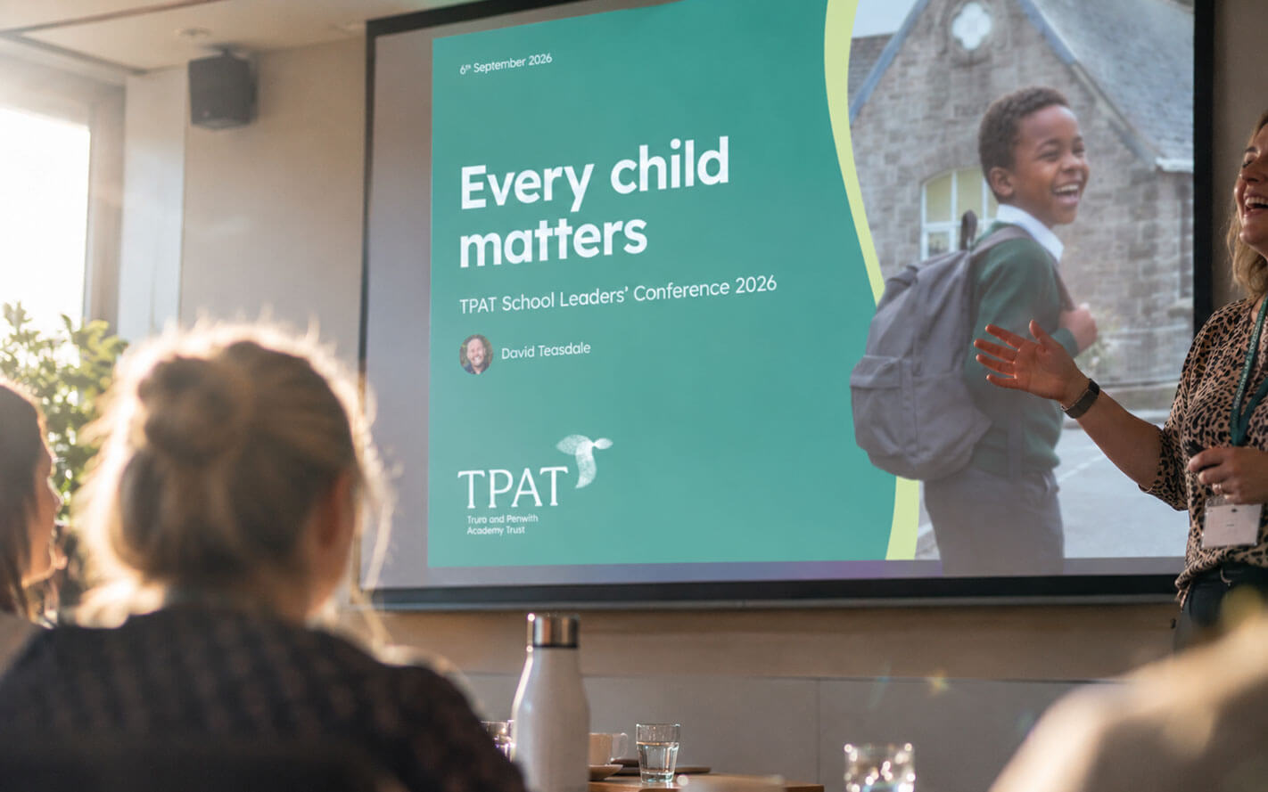
See how Oracle Design created a distinctive brand identity for one of the South West's largest multi-academy trusts, bringing 41 individual schools together around one powerful idea.
A brand glow-up for one of the South West’s largest school trusts.
Truro and Penwith Academy Trust is one of Cornwall’s largest multi-academy trusts, bringing together 41 schools across the county and the Isles of Scilly.
Each school has its own character, history and place within its community. The challenge was to create an identity that could unite them around a shared purpose without losing what made each one distinct.
The challenge.
TPAT had grown significantly, but its existing identity no longer reflected the scale, confidence or ambition of the organisation it had become.
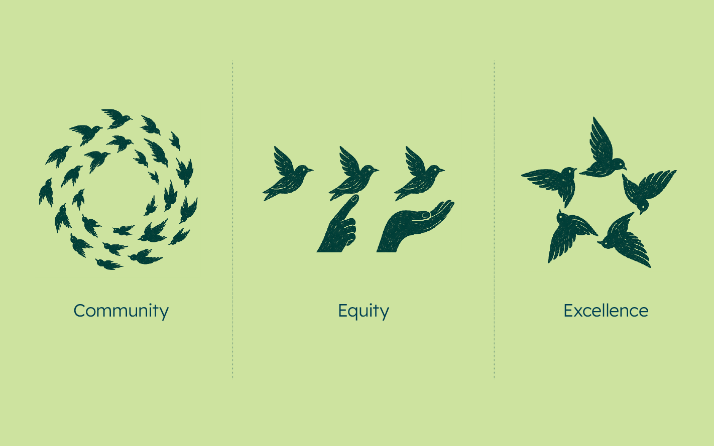
The new brand needed to bring greater clarity and consistency across the Trust, while expressing the values at the heart of its work: Equity, Excellence and Community.
It also needed to work on more than one stage. TPAT is deeply rooted in Cornwall, but its voice reaches far beyond it, from conversations with national government to the wider world of education.
The idea.
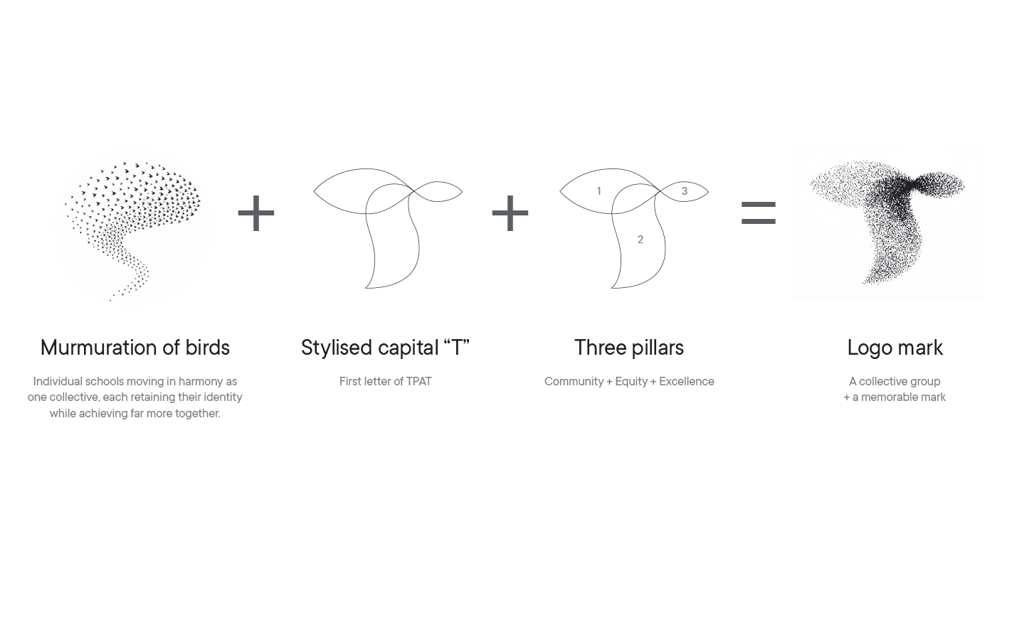
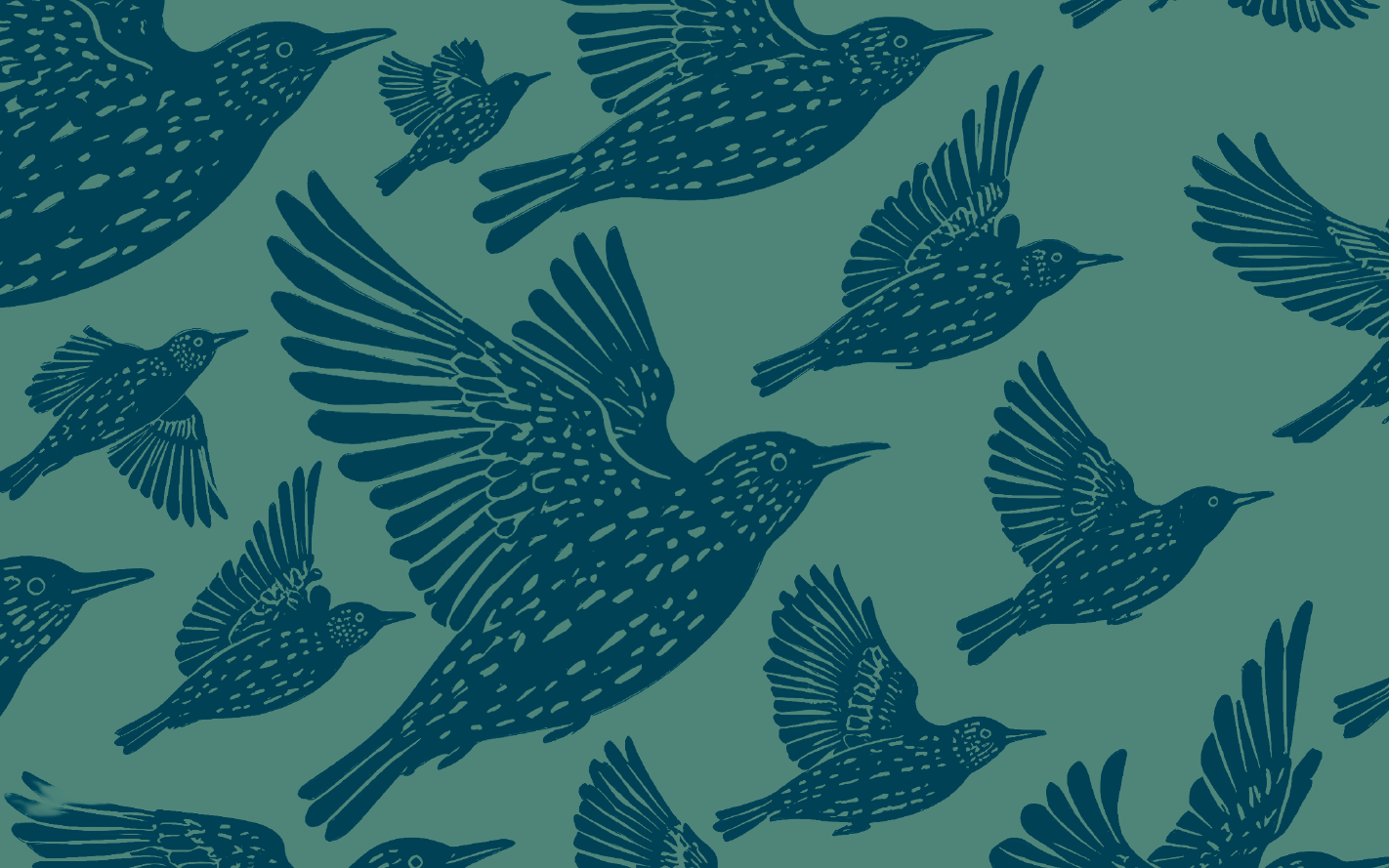
The answer came from nature: a murmuration.
Thousands of individual birds move together, responding to one another and continually changing shape. Each bird remains independent, but their collective movement creates something stronger, more dynamic and more remarkable than any one of them could create alone.
It became a powerful metaphor for TPAT’s 41 schools.
Each school retains its own identity and connection to its community, while moving together with a shared sense of purpose. The murmuration gave us more than a visual device. It became the central strategic idea for the brand, expressing individuality, collaboration and collective strength.
Creating the identity.
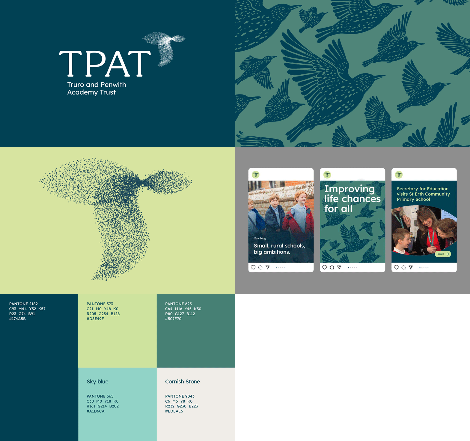
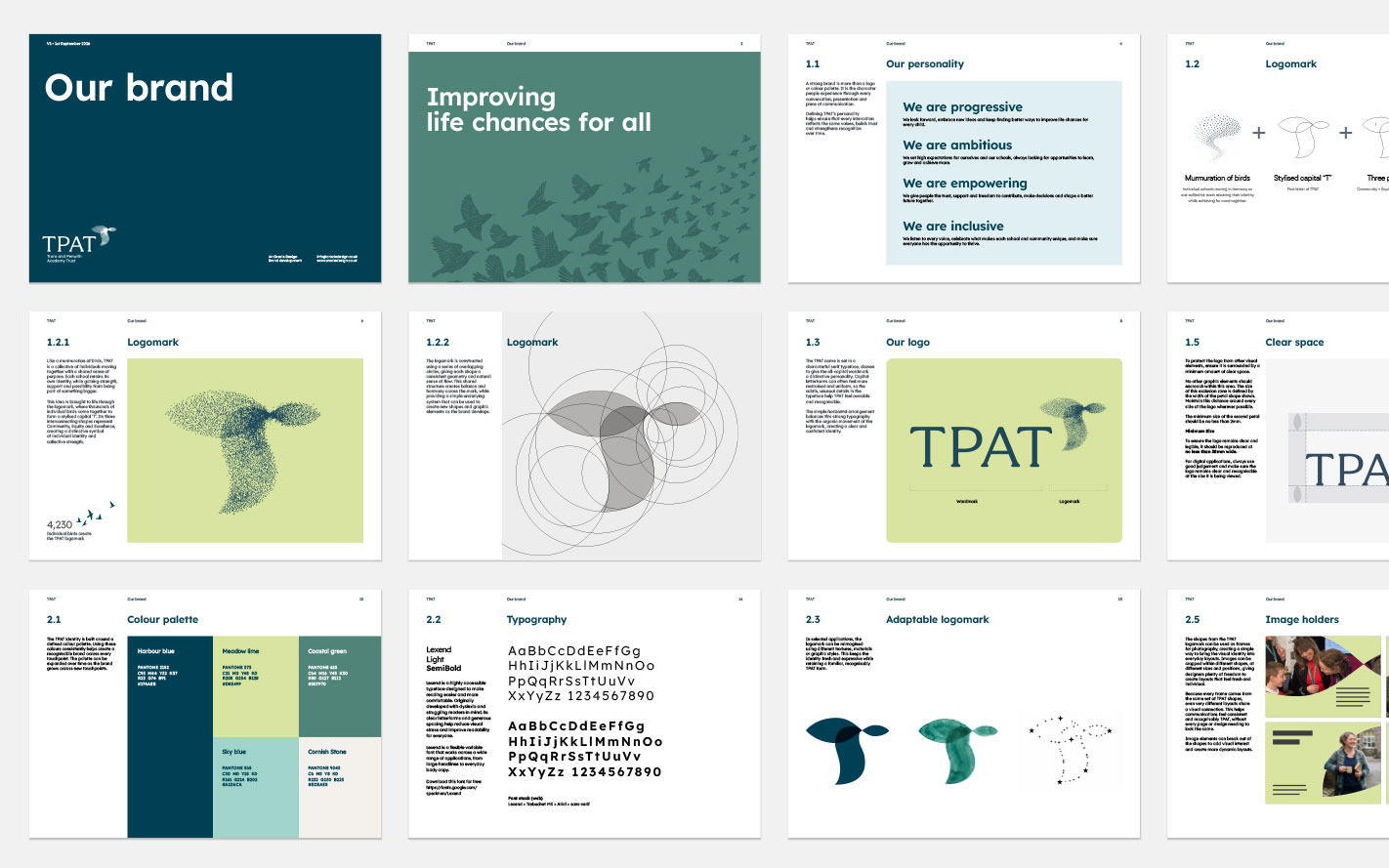
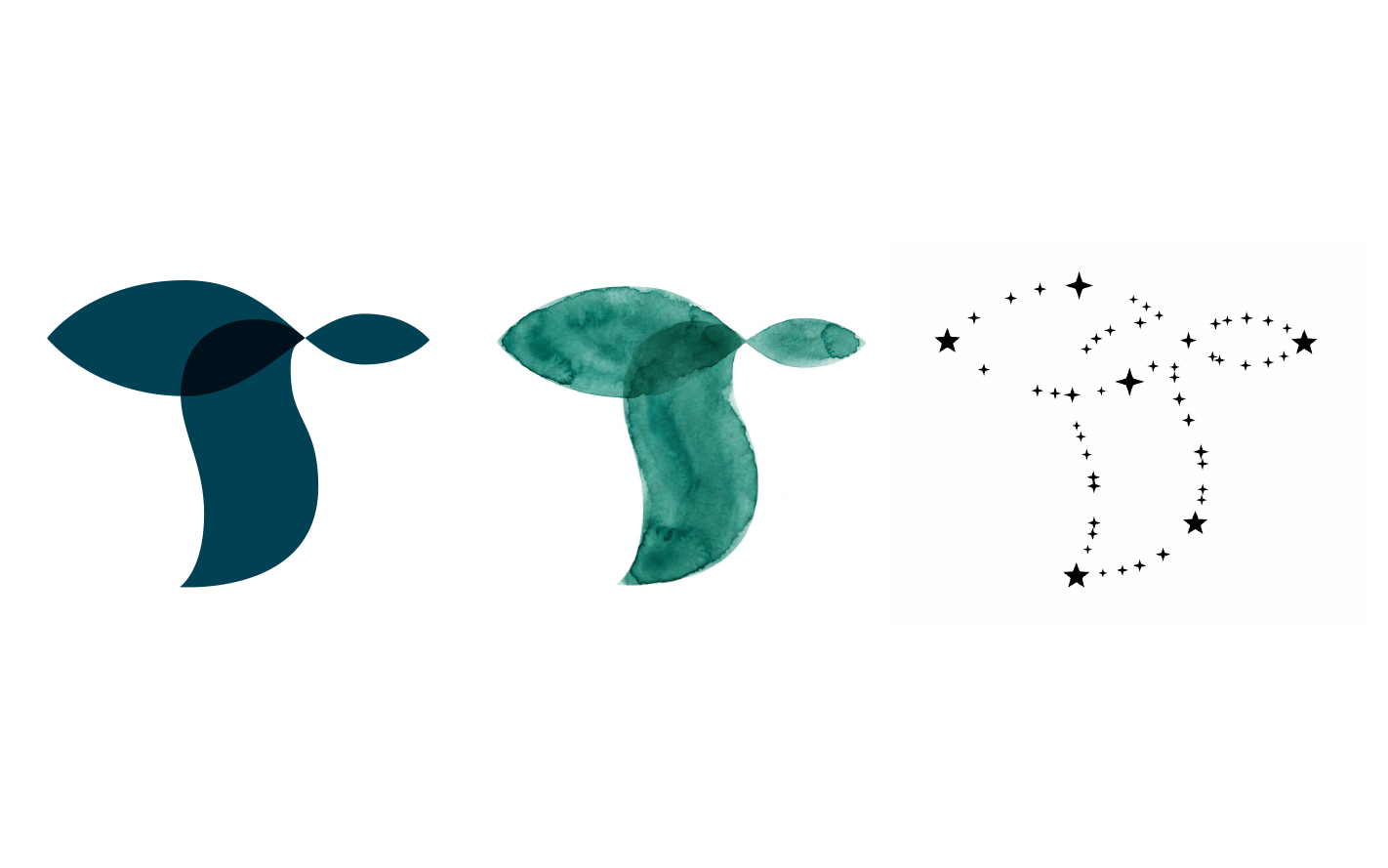
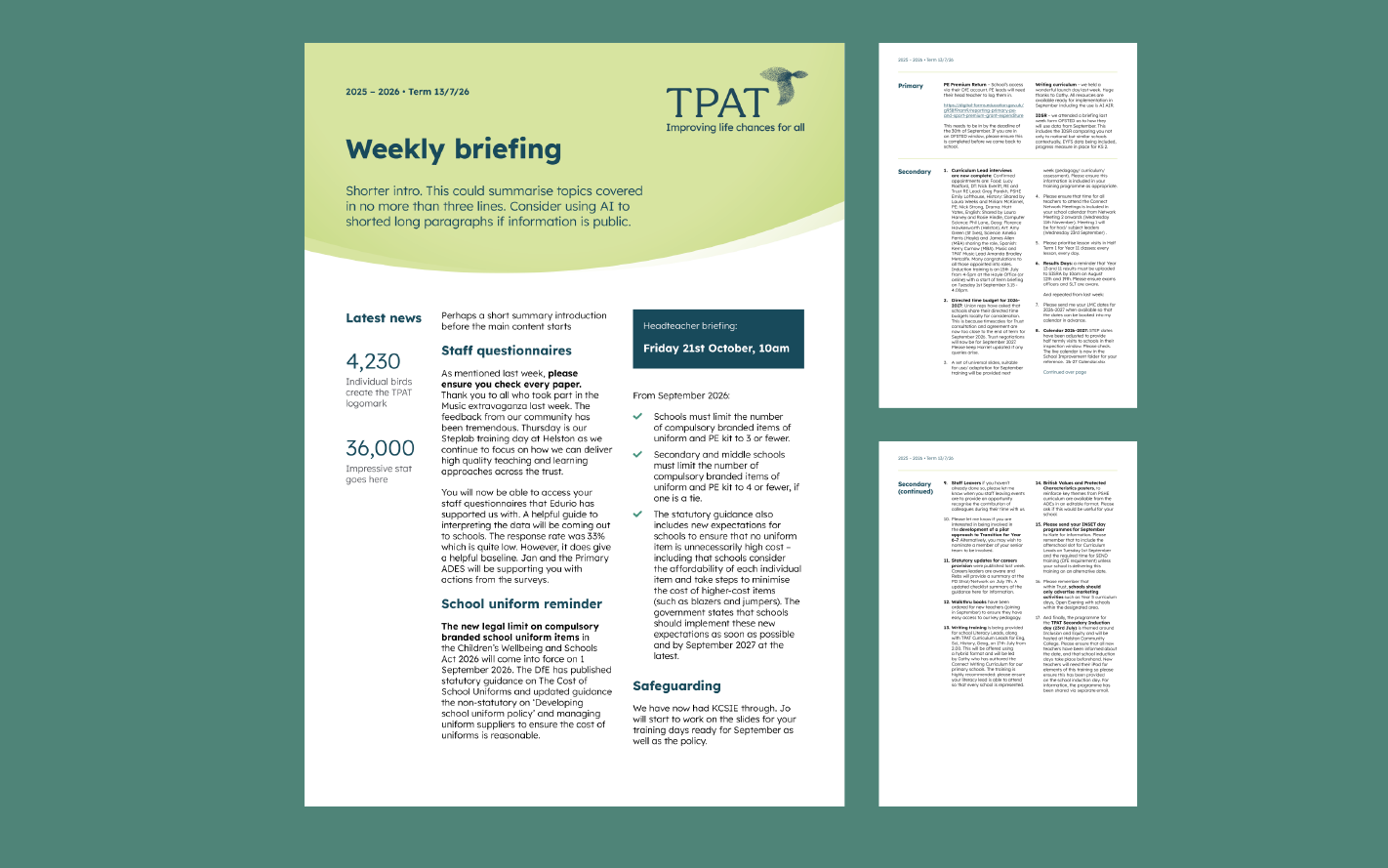
The identity was designed as a flexible system rather than simply a new logo.
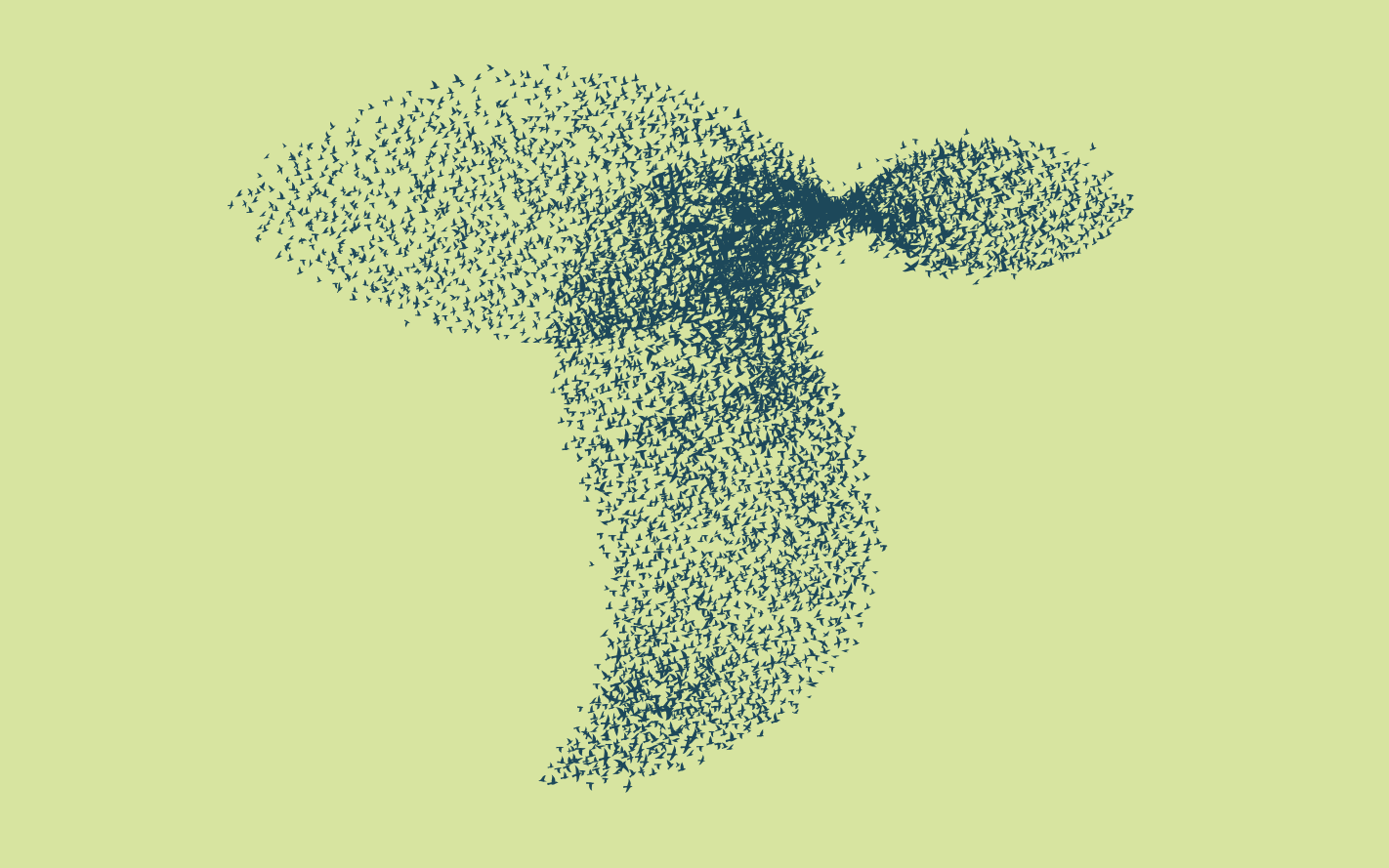
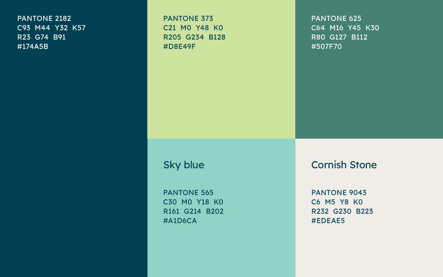
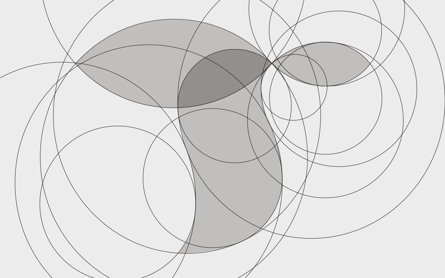
A distinctive murmuration sits at its heart, forming a recognisable symbol that can move, expand and adapt across different applications. A palette of three greens creates a strong connection across the brand, while Lexend brings clarity, warmth and accessibility to the typography.
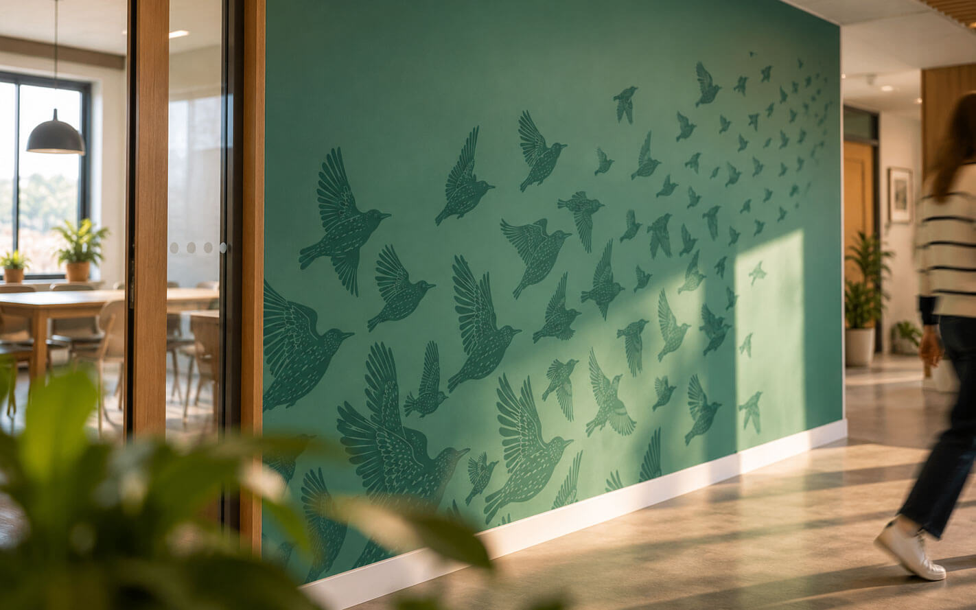
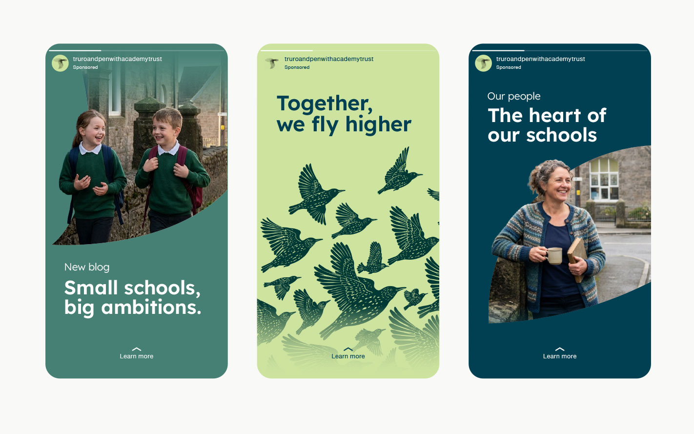
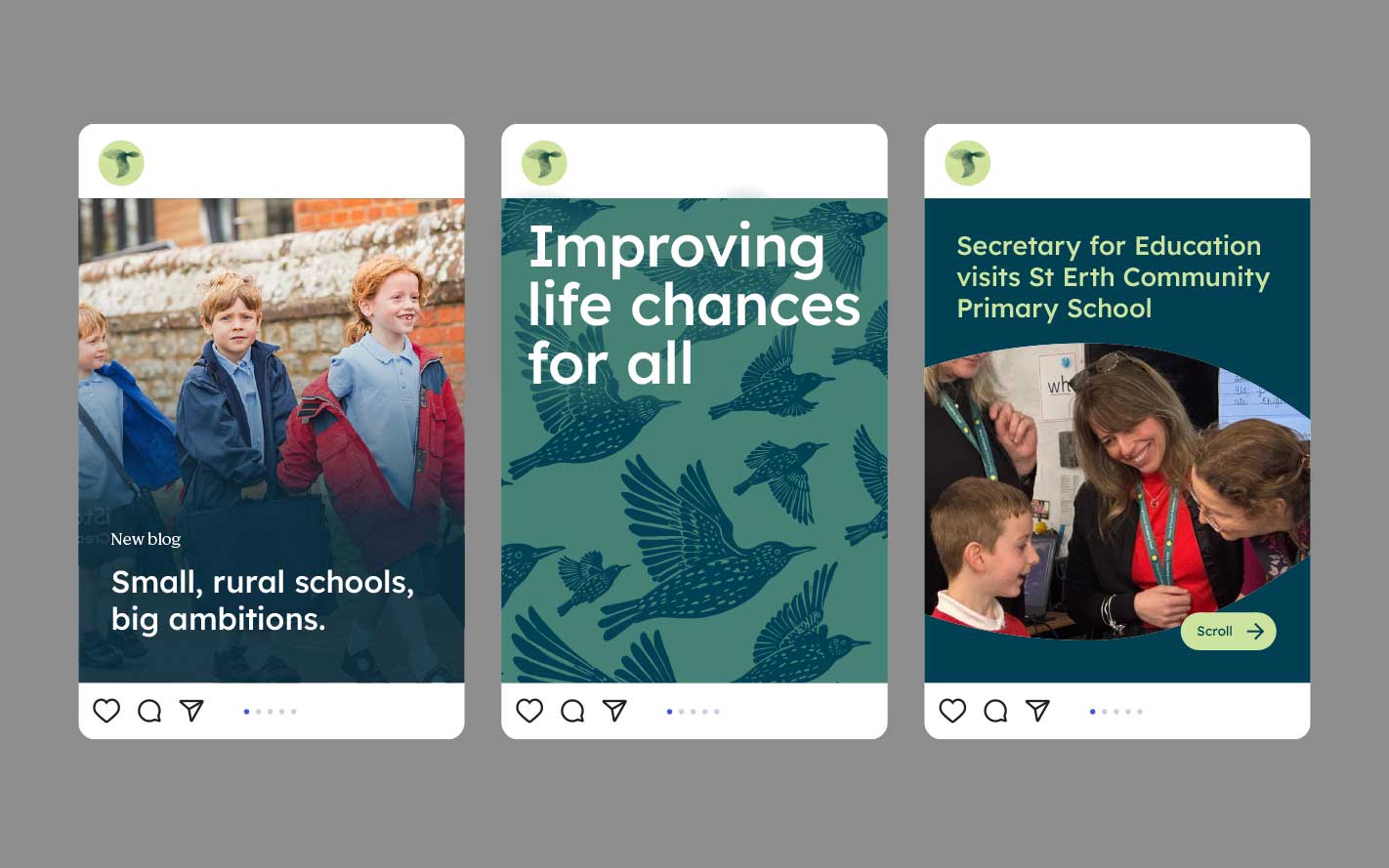
The birds became much more than a logo. They could form patterns, frame photography, move across a screen or gather into recognisable shapes. It gave us plenty to play with while keeping everything unmistakably TPAT.
The result is an identity that brings the Trust together without taking away what makes each school different.
Bringing the idea to life.
We wanted to show the murmuration flowing and transforming. The movement gives the brand an emotional quality that a static identity alone could never fully capture. Individual birds come together, find a shared direction and form something greater.
The outcome.
The project has given TPAT an identity that reflects both who it is today and where it is heading.
It is proudly Cornish, but national in its ambition. It celebrates the individuality of 41 schools while giving them a stronger collective voice.
Credits.
Client: Truro and Penwith Academy Trust
Strategy and design: Oracle Design
Murmuration animation: Nathan Yeoman

